In last week’s Color Coach video, I mentioned the importance of adding neutrals to your color palette. This is especially important when you’re using large doses of color or intense colors.
So how can you use your favorite bright color without creating the effect that your message is yelling at your recipient?
GIVE THANKS!!!!
THINKING OF YOU!!!!
It’s simple: use a lot of black and white and just a pop of bright. Here’s an example (not that Crushed Curry is so bright, but it still needed to be tempered):
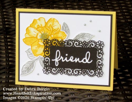
Getting my colors accurate in my pictures is a perpetual challenge, and this yellow is not as “lemon meringue pie” in real life. (It hurts me to speak unkindly of that pie, my favorite!) I love Crushed Curry and So Saffron, and IRL this card is more sophisticated than you see here, I think.
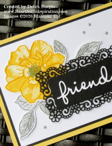
Even though I have been trying to use the products I have, I couldn’t ignore the Ornate Layers die set that had just arrived in the mail. So beautiful! I adhered two pieces of Thick Whisper White scraps together before cutting them out with this word die. It’s such a difference! Those of you who miss the Adhesive Sheets that Stampin’ Up! used to have — perfect for adhering fussy die cuts like this — will be happy to see something similar soon!
Click the images below to add current products for this card to your cart in my Stampin’ Up! online store. Disclosure: I get a commission for purchases made through these links, at no additional charge to you. Thank you!


